top of page


ROMAN KUNTELEEV
LEVEL DESIGN


CASSINI
DIABOTICAL ROGUE

The Cassini Division is a region between Saturn's A Ring and B Ring. It was discovered in 1675 by Giovanni Cassini at the Paris Observatory.
CASSINI
Summary
Cassini is set on a massive water dam, where players fight over the control of the central communications facility. The map features a circular layout with 3 main lanes overlayed over 3 floors accessable to the players where controlling the top floor is essential to win.
Breakdown
-
Gamemode: Wipeout (4 vs 4)
-
Responsible: Level Designer & Environment Artist
-
Dev-time: 2-3 Months
-
Inhouse engine (Glitch Engine)
-
Scripting using console commands
-
Doors, Teleports, Elevator
-
Table of contents
SCREENSHOTS


Top-Down


Floor 0

Floor 1

Floor 2
TOP-DOWN
Design Principles
Design Principles

3 is a magic number
I find it usefull to review the layout in most simple form/shape to grasp the general flow of the map.
Cassini forms an overlayed cross encompassed by a circle. This layout creates 3 lanes in both vertical and horizontal axis ensuring a sufficient variety of choice while avoiding exess for streamlined player decision making no matter players location.
Paths leading away from the center provide additional map control options from the vertical power positions in the center.
Providing the player with 3 options also avoids confusion and creates an easy to learn - hard to master scenario.
Icing on the cake
Cassini adheres to something I call The "Wedding Cake" principle which is a conventional method for designing maps for team-based arena shooters such as Quake and alike. The top section of the map is the smallest and offers a vantage point, providing the controlling team a vertical advantage. The second floor serves as a means to re-engage or challenge the top floor, while the bottom floor offers apportunities to retreat, rotate and regroup.
The objective for both teams is to control the top floor, as it allows for greater map control by using the vertical advantage over the opposing team.


Verticality
Verticality is a crucial aspect of an arena shooter giving an advantage to the team controlling the high ground. It also allows for and tests the players ability to utilize their movement skills to gain an upper hand - creating an engaging gameplay experience.
I use elevations to create focal points in form of power positions that dominate most of the map.

Design Techniques
Callouts
Designing unique and distinctive rooms and areas is essential for player orientation. Giving each area a distinct look and feel - helps players to quickly identify their location and navigate the map more effectively. This also enables players to communicate more efficiently with their teammates, sharing vital information about the location of enemies or objectives.


Choke Points
I use choke points to control the flow of the players movement and engagements. By creating these funnels I create risky engagement paths for the players in order to force them to commit to the fights. Think of these as points of no return in an engagement. Players may use these not only to defend an area but also to setup ambushes. Such design rewards teamwork and decisionmaking.

Bufferzones
I use buffer zones to ensure fast readability, smooth navigation, and streamlined player flow. These zones facilitate smooth movement by preventing players from misreading distances for jumps and clearly defining paths. Thereby creating a more intuitive and enjoyable experience for players.

Player Flow
The map layout prioritizes freedom of movement and navigation allowing for quick disengagement and reengagement during fights via the players abilities such as hookshot, leap & double jump. The flow of the map is balanced by always providing the player with a number of options of paths to take, but avoids excess of choice.

Design Techniques
Design Process
Design Process & Iteration
Playtesting & Iteration
My approach always follows the iterative design process of creating, testing & refining based on the tests at all stages of development - no matter the scale of the test.
Major changes
Subsequent playtests showed a number of issues with the layout. First - the upper area of the map, full of columns felt confusing by creating a large number of angles in a fast paced setting of the game and didn't feel right which was addressed by simplifying the room by removing most of the columns and adding central cover in form of a tree which now defines the room and works as a great callout.
The second major issue with the initial layout was that the upper level of the map did not provide enough vertical map control for large portions of the map thereby putting less emphasis on it causing lack of an obvious objective for the players. This in turn caused most of the fights to happen on a horizontal plane in between rotation rooms - failing to showcase unique aspects of the game. By adding additional corridors and walkways on the top floor, I gave more power to the intended power positions of the map - thereby solving the issue and solidifying the intended design.

OLD LAYOUT

new LAYOUT
OLD LAYOUT
1/2
CREATE
TEST
REFINE
Rough blockout & Testing
Initially starting with a quick and rough blockout to put down the general flow and feel of the map followed by testing and evaluating it with the level design team and the design leads primarily looking at scale and flow. Refining it based on initial feedback leading to a blockout.
Blockout
In this stage the level is further refined on previous feedback and the final major ideas are implemented.
Playtesting & Evaluating
Here the level is tested in a proper competitive setting with full teams on each side aiming to win. This phase is used to reveal all major and minor issues with the map. From flow in specific areas to the map balance and its fun factor.
Refined Blockout
Previously encountered issues are evaluated and addressed and minor new ideas and solutions are implemented.
Final Playtest*
Ideally the final playtest in the same setting is played to test the new adjustments and get a further feel for the map with a goal to finalize and lock in the blockout for arting.
Whitebox & Prep for Env. Art
The blockout is locked in and all of the blockout materials are replaced with plain white color for the ease of arting the level. Adjustments are made only on nongameplay related areas such as the Vista outside the level to for example get the form factor of the composition using simple geometry. Adjustments to gameplay geometry are only done in case of asset limitations.
env art
ENVIRONMENT ART & OPTIMIZATION
Visual Style
When it came to choosing the theme for the map my goals were to make it unique yet in style of the game so I largely based the hard surfaces on the map called Arcole - that was in its final development stage at the time.
Arcole is a map with largely plain surfaced panels covering most of the geometry set in an industrial medical structure on an island surrounded by jungle, with Turquoise and green as its main color palette.
Using the complimentary color to Arcole's most dominant one - helps Cassini to stand out and compliment Arcole while doing so.

Arcole

Cassini

Colorwise I primarily used complimentary colors to drive the accents of different parts of the map basing it of the complimentary palette interplay of the maroon & cayenne being complimented by turquoise and light blue so that the transition from inside to outside of the map feels coherent by colors playing into each other.
For smaller details around the environment I let the analogous palette of the dominant color to determine the colors of for example smaller vegetation, decals and water.
60/30/10 Rule
Throughout most of the map, I try to use the 60/30/10 rule as a guideline to determine the saturation of an area using certain colors. This naturally creates the color hierarchy in the composition leading to balanced and harmonious visuals in the level.


Whitebox - vs - Final Art


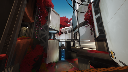


Optimization
Most of the heavy lifting in the optimization department on the level design side, was done primarily by LODs and the VIS system we had.
The approach with LODs was straight forward:
The highest level of detail was used around play areas - the most accessible points for the player. The further away you got - the worse quality LODs are used. One caveat was that if the quality of the model was visibly low even at further distance - the higher LOD should be used.
On the screenshot provided:
Red = High LOD.
Yellow/orange = mid level LOD.
Green = Low LOD.


VIS system wasn't as straight forward yet it was quite easy to get your head around.
The way it works is simply by setting the player camera in different positions of the map and tracing for different props. The amount of traces could be adjusted for higher accuracy. Based on those intersections the engine determines if a prop is obscured at a particular angle and if it should be rendered or not.
This approach wasn't without flaws though. The algorithm could miss certain props at certain angles. Some additional VIS work was required to be done by hand using a number of console commands.
On the screenshots you can see what's being rendered with the inverse version - where the opposite viewing mode in the VIS system is used to show what would be hidden by the system at this angle.
bottom of page